[ez-toc]
CTAs are like little tasks that prompt visitors to do something on your site, such as downloading an ebook, signing up for a newsletter, watching a video series, or making a purchase.
Using call-to-action (CTA) buttons on a website is like putting up a signpost that points visitors in the right direction. When someone clicks on the CTA, it’s like taking the first step down a path that leads to an amazing experience with your product or service. It’s an important part of any successful website and can be a great way to encourage people to take action!
In this article, we’ll cover best practices for creating effective calls to action. We’ll talk about which types of CTAs work best on websites, how to choose relevant CTAs, and how to get creative with them!
What is a good call to action on a website? (Factors to consider for an effective CTA)
A good call to action on a website is one with the right color and text.
Call-to-action Color
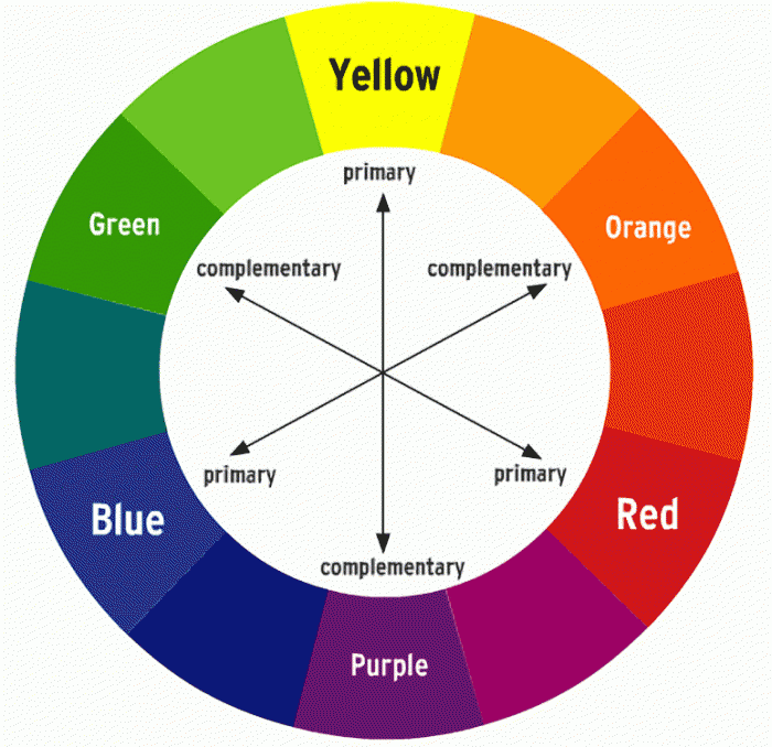
The CTA button color should always stand out from the rest of your landing page, making it instantly viewable with minimal effort. You can use the color wheel to determine the contrasting color from your website theme that would make your CTA more noticeable. For example, if my website has a blue theme, I would go for an orange CTA button that stands out against my page background.
Use the right text to boost conversions
Keeping the text concise but persuasive will help you move people to click on it as well. Your language should be clear and simple but still, invoke action from the reader – “Discover Now” instead of “Read More” is a great example.
You should also consider using visuals with CTAs like images or videos that explain what will happen when someone clicks on them. This can be used to give people an extra nudge in taking the desired course of action – watching the video or visiting a product page etc.
With good design, careful research, and thorough A/B testing of all contributing factors, you can develop a call-to-action so effective that it helps drive conversions!
How to use A/B testing to test CTAs?
Understanding what constitutes a good call-to-action (CTA) on your website is essential to getting the right results. By researching and A/B testing various CTA’s, you can get an idea of what works best for your site.
Split testing involves comparing two versions of your CTA button, typically one that offers the targeted version and a generic version. By doing so, you can track the performance of each variation and determine which performs better in terms of user engagement, clicks, and finally conversion rate. Doing A/B split testing helps you choose which CTA works best for your target audience and draws more attention from users when they hit your page or blog post.
It’s interesting to know that while most website owners do opt for split-testing their websites, emails, or landing pages; they forget about CTAs altogether – only to leave out a great source of potential sales! Therefore it’s important to test CTA buttons periodically in order to get the best possible outcome.
A recent study has shown that personalized CTAs convert up to 42% more than typical untargeted CTAs. This denotes how crucial it is nowadays to personalize calls to action in order to achieve maximum results with minimum effort! So make sure your next big move involves personalizing & split-testing every aspect of your online presence including Call To Action as well.
Examples of an effective call to action
Netflix

Netflix is one example of a company that has perfected the art of an effective call to action. They have a bright-white email box with a red button that stands out against their dark background, ensuring that it will be registered by viewers as soon as they begin reading.
This attention-grabbing button leads to a page where Netflix members can quickly and easily sign up for their services. It also features two call-to-action buttons, in case viewers need more incentive to try the service, both of which ultimately lead to the same sign-up page.
By creating an easy and effective way for their potential customers to take action, Netflix has been able to increase its customer base and generate more revenue from every new sign-up.
WP Rocket

WP Rocket follows the “I want you to __” formula when it comes to CTA design. This formula focuses on directness, simplicity, and specificity so that visitors know exactly what action they need to take when they come across these buttons. For example, a CTA on the WPRocket homepage might say “Speed up your website” which clearly indicates what visitors should do if they want to get started with this product.
Of course, not everyone will know exactly what the “I want you to” formula is or how it applies to web design. To explain simply, think of it like a call from a friend asking for help doing something: “Hey, I need help with __ can you do it?”. It’s this same idea that is applied in every CTA from WPRocket; directing visitors towards specific tasks that will lead them closer to becoming customers.
Channel 12

Using a call-to-action that instills curiosity can be more effective than other more common CTAs such as “Learn More” or “Call Now” because it appeals to people’s desire to learn more without making it feel like a commitment. By asking a question, or by providing just enough information through the CTA, you can hook users in and encourage them to click on the button or link.
This type of CTA tactic is particularly useful if you want your website visitors to act in order for them to gain something from your site. Crafting an intriguing CTA which invokes curiosity in their minds, can help you increase conversion rates with fewer resources and effort on your part.
How to add a call to action button on WordPress?
The simplest way of adding the button on WordPress is by using the in-built “Layout elements” feature. This allows you to add different types of elements like headings, images, audio players, etc. Fortunately, it also has a “Button” element which enables you to add the CTA button without any programming knowledge.
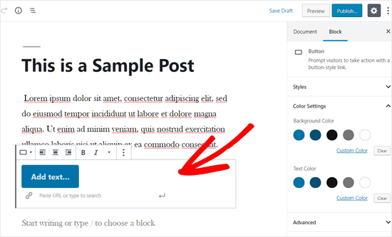
Before you add a CTA button, you should create or edit an existing post that stays within your website’s theme and color scheme; once you do that, all you have to do is click on the “+” icon available in the layout elements section and then choose “Button” from the available options. The editor should now display your CTA as a text field; this basically means that adding text, creating alignments, and inserting URLs would be very easy from here onwards. You can even change the style of your CTA directly from this window.
Simple changes to CTAs that help improve conversion rate
Sometimes it is not just the color and text of the button that matters – elements surrounding the CTA also have a huge impact on how quickly and effectively they convert visitors into customers. A common mistake made by almost all website builders is to clutter their pages with too many elements that take away focus from the CTA button itself. By keeping surrounding elements minimal, you direct the customer’s attention to your CTA and increase conversions noticeably.
The best way to do this is by leaving around a decent amount of white space and making sure there are no cluttering components apart from yours, such as social media icons or advertisements.
For example, one of my friends runs an online plushies store and was trying very hard to increase his conversion rate without much success until he took away all unnecessary elements from his homepage including social media icons, call us now numbers, etc., leaving out quite a lot of white space in between elements so “add to cart” catch visitors’ eyes easily. The result – his sales went up by 22% because visitors were directed straight away towards where they needed to click!
The integration of heatmaps into your website can also prove very beneficial here; they can allow you to keep track of where users click, thereby helping you decide where would be an ideal place for your CTA.
Last but not least, make sure to use action words or an action phrase like ‘Sign Up Now’, or ‘Grab it now’ etc., This will add weight and context to the simple button image, thus enabling a higher chance of user engagement resulting in a better conversion rate.
How to add a call to action button on a mobile website?
With more people using their phones and tablets for online activities, it’s important that your website be optimized for mobile devices. If you want the CTA button to lead to a landing page or sign-up form, then you can do this using HTML and CSS. Most sites are responsive nowadays so you don’t have to worry about optimizing it specifically for mobile viewports.
However, if you want to create a click-to-call button then there is an easier way – install the “Call Now Button” plugin on WordPress. After activation, you can find the CTA button option on the left side panel of the WordPress dashboard. You can customize it by making necessary changes like changing text and appearance. It’s fairly intuitive so setting up shouldn’t take too long.
Final Say
With effective CTAs, you can make your important landing pages stand out in a big way. I’ve just given you a rundown on what a call-to-action is, as well as some tips for making it as enticing as possible. Now it’s time to take what you’ve learned and put it into action! Put your knowledge to the test and watch as your landing pages draw in more and more visitors.